From Confusion to Confidence: Redesigning Certn’s Homepage
Client
Certn
Industry
Security
Platform
Responsive Website
My Role
UX Designer
Project Timeline
Jun 2022 - Sep 2022
Background
Certn is a global background screening platform serving both individuals and businesses. With services ranging from reference checks to international criminal background checks, the product experience is grounded in trust, clarity, and usability. This project focused on improving landing page conversion by better segmenting users and tailoring the experience to their distinct needs, helping users more clearly understand available background check options in Canada.
The Problem
Certn’s existing homepage was struggling to keep pace with evolving customer behaviour and expectations. Users faced long, time-consuming processes and lacked the information needed to make confident decisions, leading to uncertainty. These challenges created friction, reduced trust, and ultimately impacted conversion, highlighting the need for a strategic redesign that better supports users and their decision-making.
The Challenge
Serving both B2B and B2C audiences made it difficult to deliver a single web experience that felt relevant and trustworthy. Poor user segmentation and unclear information hierarchy reduced usability and discoverability, ultimately impacting conversion despite high traffic.
Heuristic Analysis
A heuristic evaluation was conducted to better understand the strengths and pain points of the existing user experience. The objective was to identify usability issues that were negatively impacting user comprehension and conversion. Given a tight timeline, we partnered with stakeholders to prioritize the highest-impact changes to narrow the scope on changes that would deliver the greatest user and business impact. The site shown reflects the pre-redesign experience.
The Goal
Sharing personal data is a trust-driven action, making credibility and clarity critical to the Certn experience. The objective of this project was to extend Certn’s trust foundation by creating a clearer, more confident web experience for both business and individual users, while improving conversion performance.
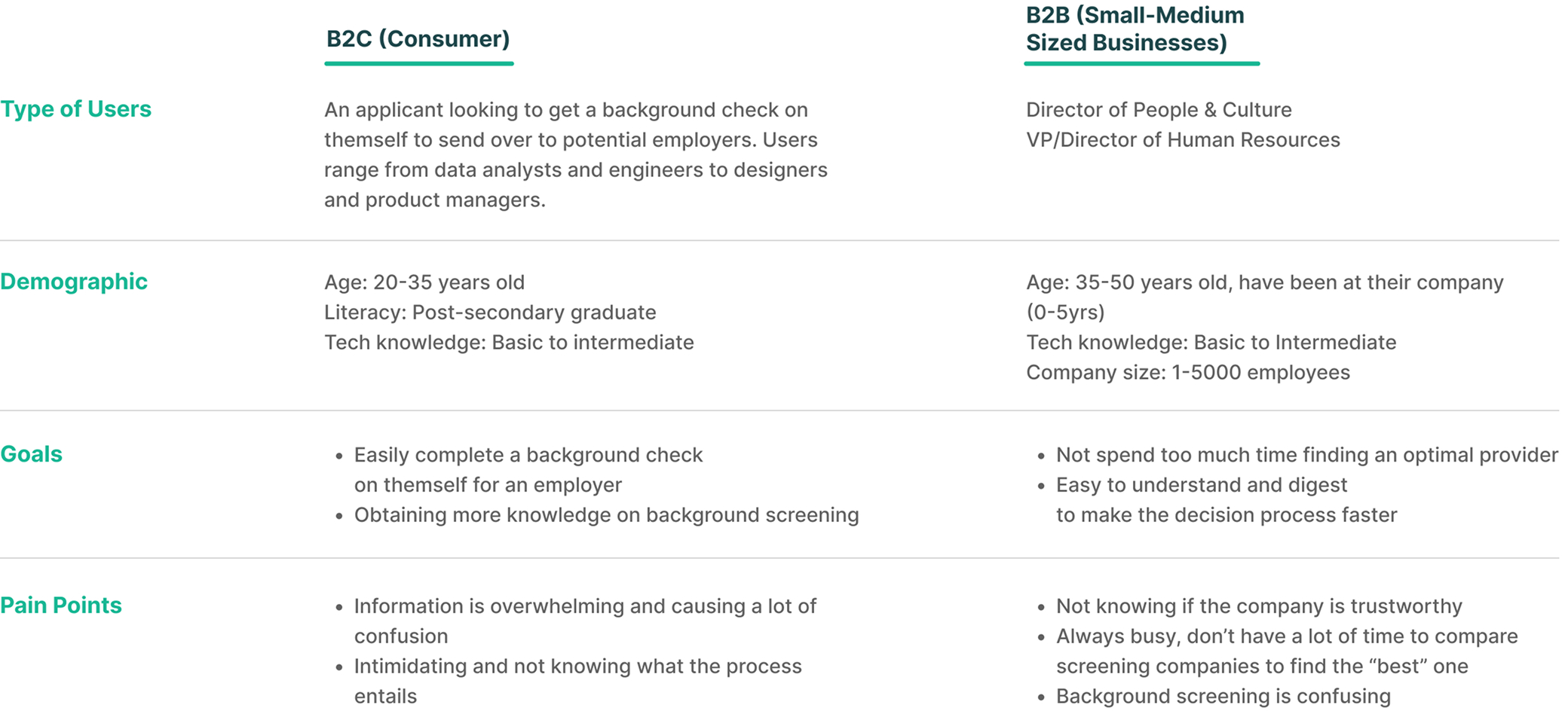
Personas
At project kickoff, we conducted internal interviews with cross-functional teams who work closely with customers to understand their goals, needs, and pain points. In close collaboration with stakeholders, we aligned on key findings and recurring themes, ultimately defining two primary user types: Consumers and Businesses. Synthesizing insights from hours of interviews provided a shared understanding of our users and established a strong foundation for the design decisions made.
We discovered the top frustrations among our users:
Knowledge and Industry Gap
There is a gap between our demographic and what they know about the background screening industry. What they know versus what they discover makes them feel overwhelmed and unprepared from the start, therefore abandoning the process altogether. We determined that the vast majority of our users are looking to find out what “screening” will entail.
Cognitive Overload
Users feel intimidated and confused when navigating through the website before converting to Certn. The complicated interface forces users to find solutions to problems that shouldn’t be there in the first place. This leads them down a path of frustration and uncertain decision-making.
Trust
Users generally don’t feel a sense of security or satisfaction when navigating through background screening websites to figure out which platform would best help achieve their goals. They feel there is not enough transparency. Customers are looking to interact with companies that can deliver great experiences throughout all interactions and touchpoints, especially on a landing page before converting.
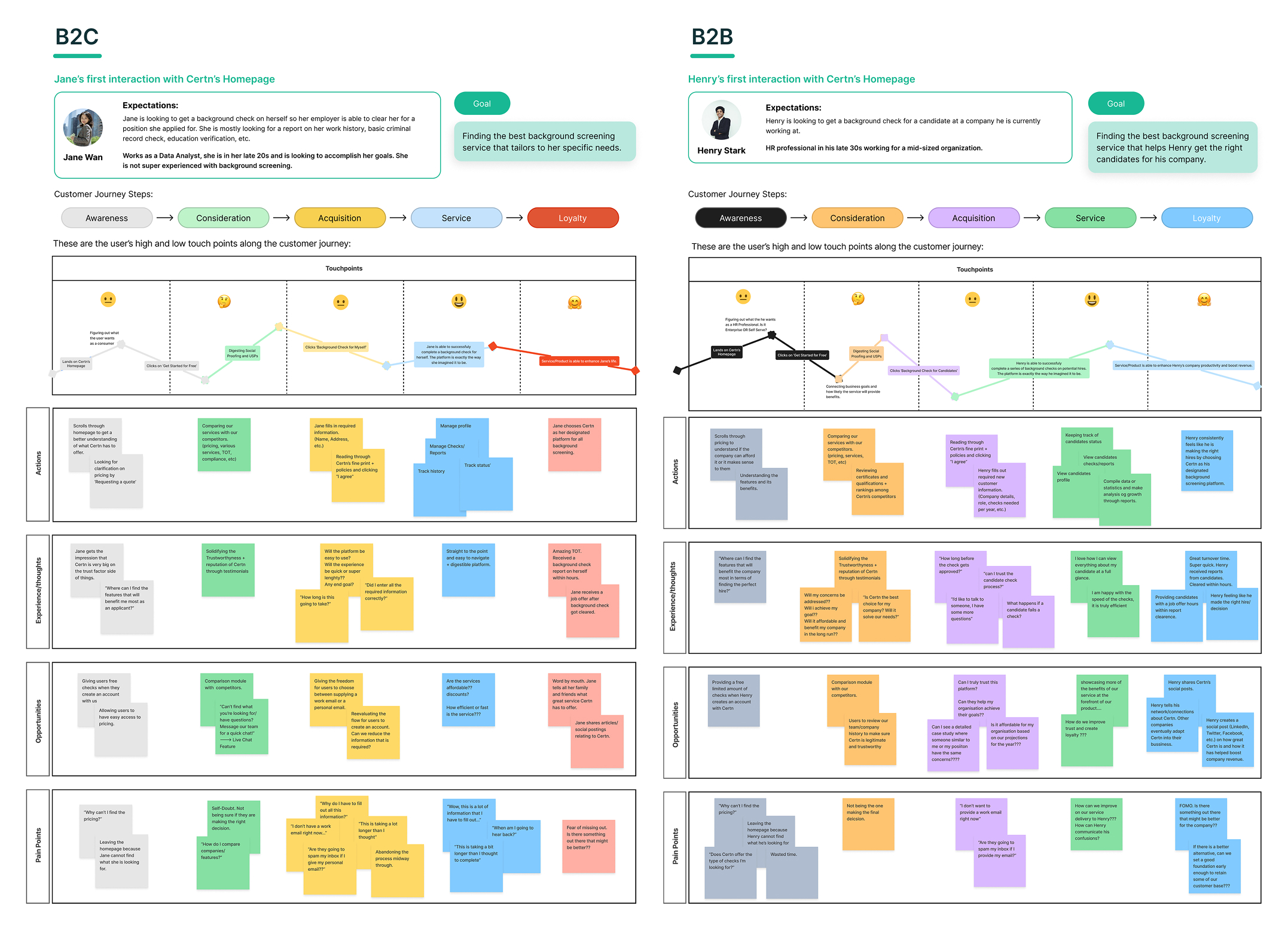
Journey Mapping
The team created journey maps to systematically capture the end-to-end user experience and uncover friction points at each stage. These maps helped us prioritize features based on user impact, align on where to focus design efforts, and establish clear benchmarks to measure improvements over time.
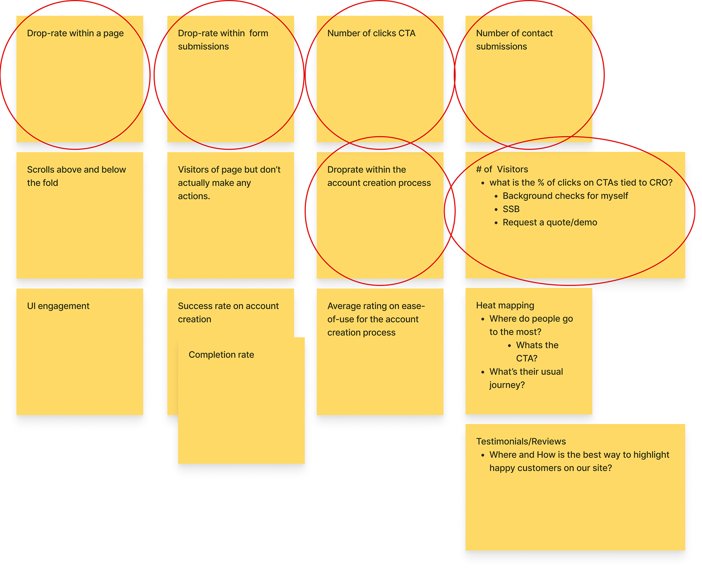
Benchmarking
To ensure design decisions aligned with business objectives and drove measurable impact, we first established a baseline of the current experience. By analyzing Google Analytics and Hotjar data, we identified key user behaviours and pain points, which informed metric-driven design decisions and helped prioritize improvements that would have the greatest effect on quarterly goals.
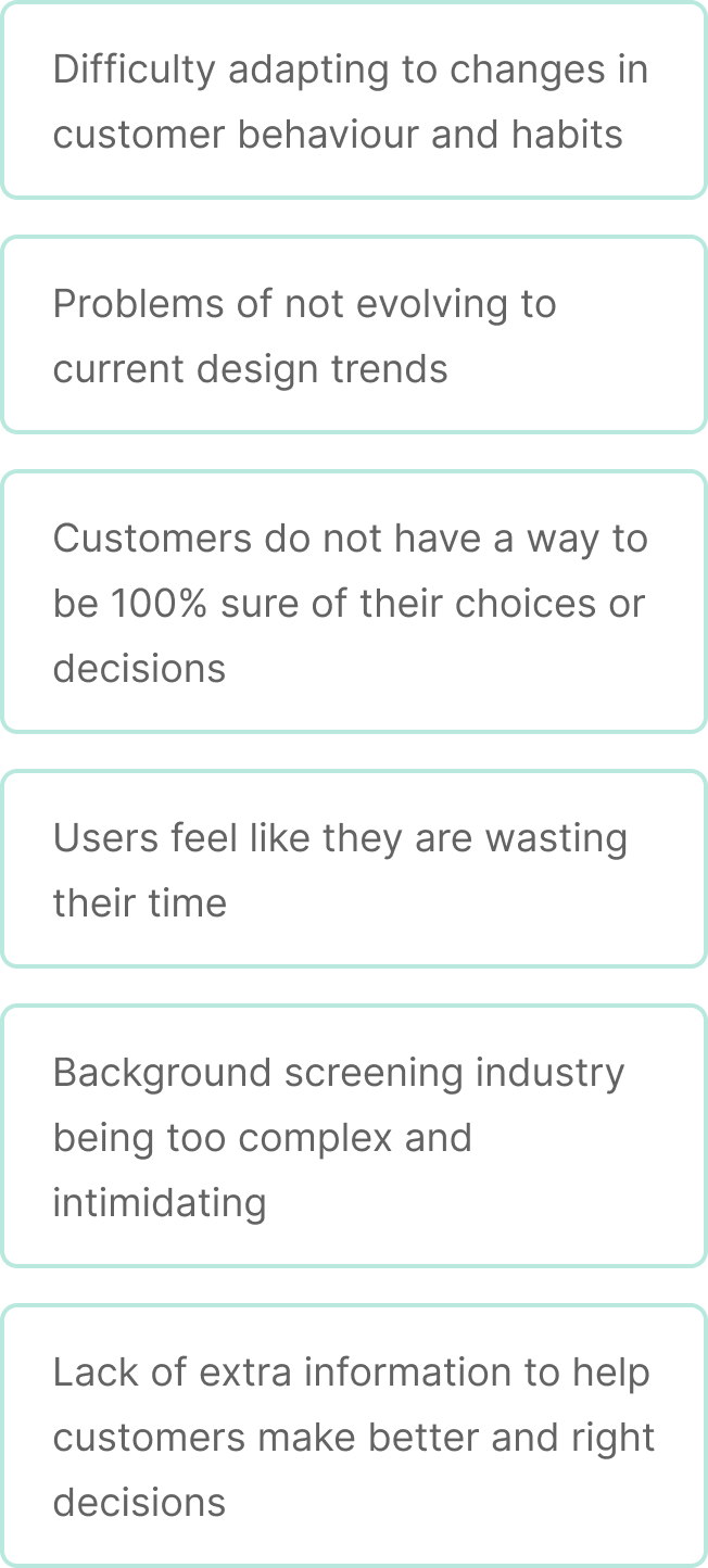
What are some common problems?
Information Architecture
Information architecture was used to systematically map existing features and identify opportunities to improve structure and flow. Once mapped, features were reviewed and prioritized with stakeholders to define a focused MVP scope. This process established a clear baseline of the current structure while enabling us to propose a more intuitive, user-centered flow. The resulting site map outlines core features, content, and key user paths, highlighting logical relationships and supporting faster, more informed design decisions.
User Flows
User flows were used to define the step-by-step experience for critical user actions, including demo requests and account creation. Separate flows were mapped for B2B and B2C users to reflect their unique needs while maintaining a consistent, intuitive structure from start to finish. These flows helped validate feature requirements and simplify complex interactions.
Designing the Solution
To explore a wide range of solutions, we began with low-fidelity sketches that allowed for fast iteration and concept exploration. The team worked independently to generate diverse ideas, then came together to evaluate and test variations. Insights from this collaboration informed the direction of the wireframes and set the foundation for visual design.
From Validation to Delivery
After aligning on a validated solution and securing stakeholder approval, we transitioned into high-fidelity design. Continuous collaboration with the development team ensured feasibility and alignment throughout delivery. Following the MVP release, A/B testing was used to collect insights and guide ongoing iteration.
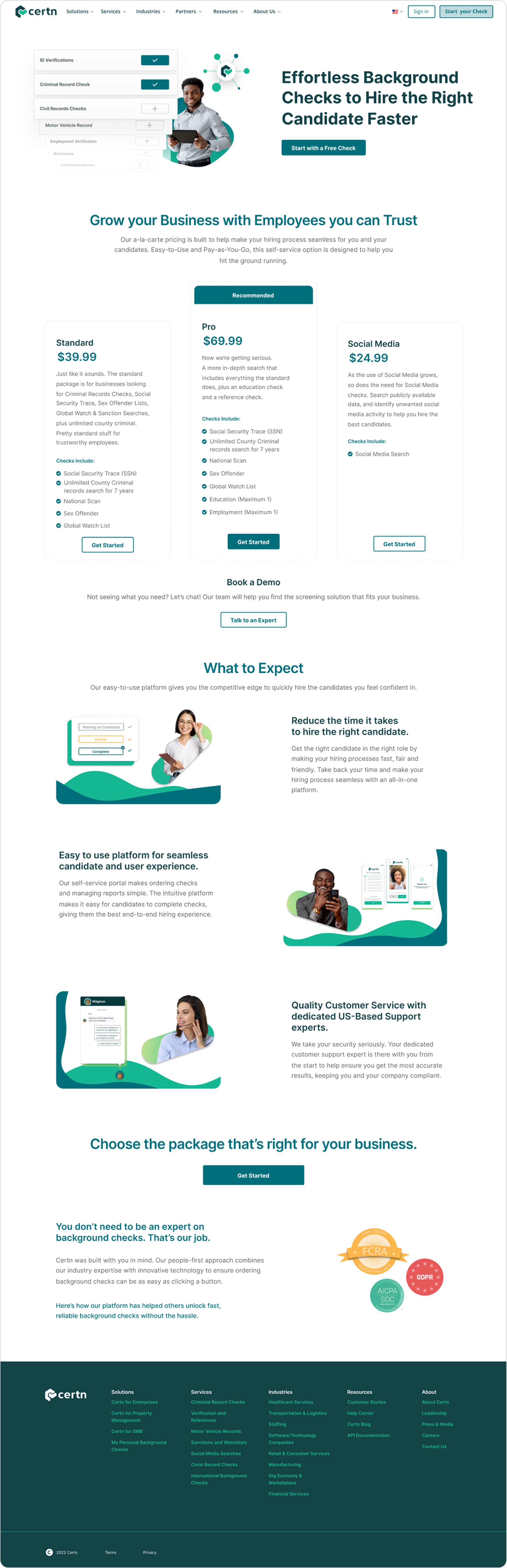
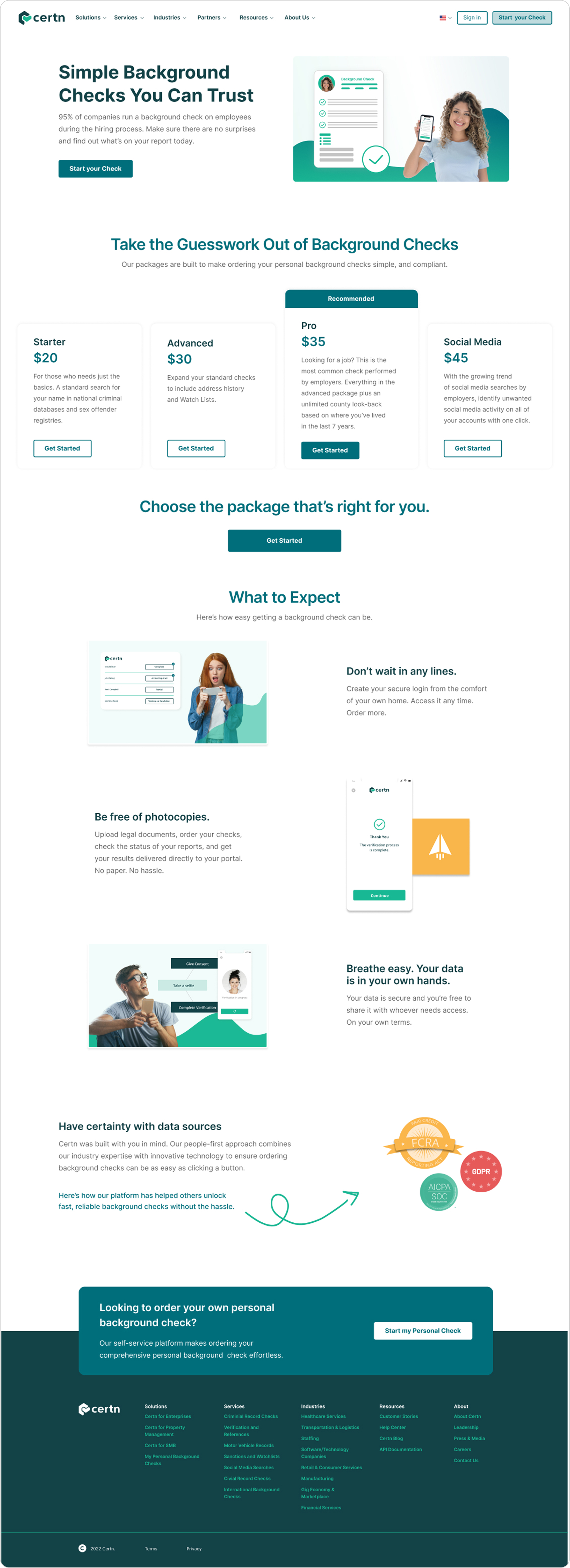
Redesigned homepage
To reduce cognitive load and improve clarity, the experience was segmented into two distinct homepages: one tailored to consumers and one for businesses. Each homepage focuses on a specific user group, clearly outlining relevant services and included features. By limiting choices and clearly communicating value, the experience guides users more confidently toward conversion.
User Testing
Usability testing played a key role in identifying friction and validating design decisions by observing users complete key tasks. Findings surfaced areas of confusion helped inform iterative refinements to improve overall clarity and flow. A/B testing was then used to measure success against established benchmarks, resulting in a 5–10% lift in conversion rates across the updated pages.
Reflection & Key Learnings
This project reinforced the importance of balancing research, design, and stakeholder collaboration to drive meaningful outcomes. By grounding decisions in both qualitative research and analytics, we improved clarity, streamlined user flows, and delivered measurable gains which allowed us to improve the overall experience and drive business impact. At the end of the day, data alone can't tell the whole story and seeing the full picture is critical in turning insights into practical, outcome-driven solutions.